Redesigned a recruitment platform that eliminates technical friction, creating a streamlined and stress-free interview experience for candidates and employers.

During this project, I owned the end-to-end redesign of Pod's interview platform, which was built to connect academia, companies, students, and alumni.
I started by establishing the design vision and guiding the product direction. I conducted the core user research that influenced our design decisions and mentored a team of developers and product managers to bring the new vision to life. The final app overhaul and transition to a modern dashboard streamlined the user flow and enhanced the overall experience.
8 Months
Me (Lead Designer), 2 designers, 2 Product Managers, 10 developers
Figma, Miro, Google Analytics, Maze
Pod needed a total revamp of their platform. The current version faced several issues, including user experience challenges, scattered functionalities, and an incoherent user flow.
The design required users to expend excessive mental effort to complete tasks, leading to a poor user experience.
Key features were spread across the platform, making them difficult to find and use, which hindered productivity.
Users struggled to navigate the platform, leading to frustration and inefficiency. There was no clear path from start to finish.
The dashboard focused on a smooth user experience and stress-free environment, providing a comprehensive interview platform. We wanted it to be a one-stop solution for all interviewer needs, ensuring simplicity and efficiency throughout the process.
The new main dashboard was designed in a three-column layout to bring all core functionalities into one intuitive view. This allowed interviewers to manage questions, review candidates, and take notes without navigating away from the main interface.

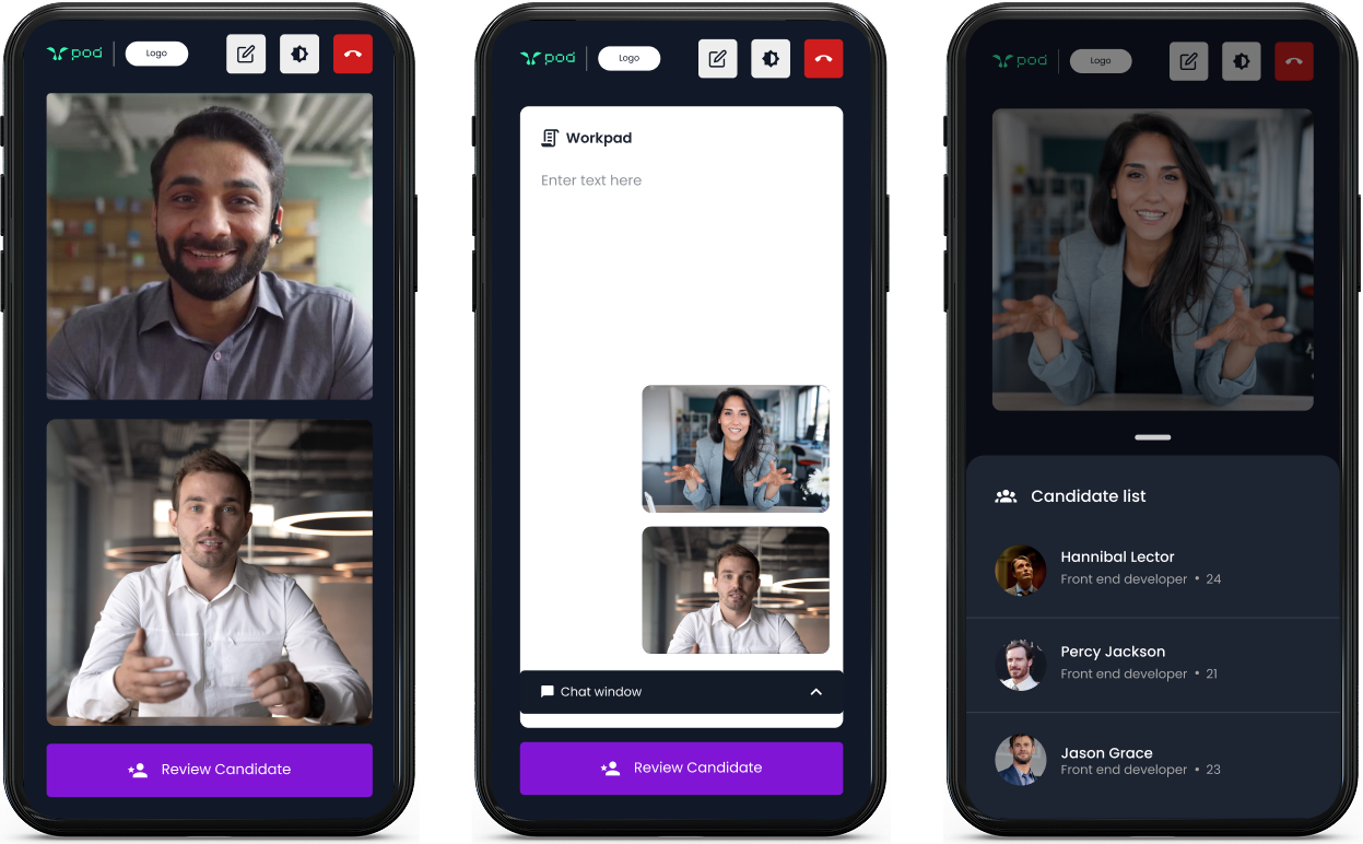
The mobile experience was streamlined by focusing only on essential features for users on the go, ensuring a simple and effective experience on different screen sizes.
To address the need for streamlined preparation, a dedicated question bank was created. This feature allowed interviewers to add, save, and categorize questions, eliminating the need to search for or recreate questions for every new interview.

The mobile experience was streamlined by focusing only on essential features for users on the go, ensuring a simple and effective experience on different screen sizes.
The primary users were divided into two subgroups: Interviewers and Interviewees. Research efforts, including a competitive analysis, interviews, and usability tests, focused on uncovering pain points and building a knowledge base to guide the redesign. The key research questions were:

What functionalities do users want in the dashboard?

How can we consolidate scattered functionalities?

Can we help interviewee feel more relaxed during an interview?

How do we improve the current interface's usability?
I conducted a thorough competitive analysis to research and identify features and design conventions that were being used in dashboards by other firms. Having a strong knowledge base in this space helped me better understand the scope and prioritizing features in our dashboard.

After gathering insights from the secondary research and market analysis, we had some key features decided. To solve the problem features being scattered, we decided to consolidate them in the dashboard. We also decided to add onboarding for both interviewers and interviewee to give them better context.

After finalizing the scope and functionalities that were gonna be included in the dashboard, we started building the user flows for both, interviewers and interviewees.


The redesign was a direct response to user research. Each design decision was strategically mapped to a specific user need or pain point, transforming the dashboards core weaknesses into strengths.
The main interview dashboard was designed in a full-screen, 3-column layout, bringing all previously fragmented tools (coding pad, question panel, review panel) into a single view.
The consolidated dashboard allowed interviewers to instantly access direct tools to add, create, and manage questions from the primary view.
The consolidated dashboard allowed interviewers to instantly access candidate information and review their answers directly in the primary workspace.


The product focused on optimizing the mobile experience with only essential features and functionalities.
This was my first Edu-tech project, I learned to integrate psychology into design to reduce interviewee anxiety and refined my visual design skills. Working with a large developer team improved my communication abilities, and collaborating with awesome people helped me learn and grow throughout the project.
With this, we were able to accomplish some incredible things:

Efficiency Gains: Successfully consolidated fragmented interviewer tools, which, reduced average preparation time of interviewers by 17%.

Human-Centered Impact: Leveraged design to reduce candidate pre-interview anxiety by an estimated 21%, proving that psychological comfort can be a key product metric.

Process Improvement: By adopting a structured workflow and design sprints, we cut the overall design cycle time by 32%.
